Showing posts with label All Things Decorating. Show all posts

2.22.2013

::Brave Color, Brave Bloggers::

As I tenuously dip my toes into the idea of decorating a new house, I find I'm challenging myself to be open to what colors really make me happy.  Ya'll know I already have an obsession with blue and brown.  
Duh.

my current fabric stash...only half-way organized because the house was on the market.

But I also love pinks and reds with yellows, bright aqua and spring green.
I'd even throw a little purple love in there too....


Maybe it's just because we're on the tippy edge of February's demise, listing heavily into March, which means spring is coiling itself up like some sort of seasonal slinky, ready to burst thru the surface in an array of tulipy, hyacinthy, crocusy goodness.  Not that I planted any, or would be in this house to see the show if I did.
 But, the gray drearies are destined to melt away leaving wide open patches of lovely.
Believe you me. 

As I consider what I already own, what the style of house will be, and our budget.....basically my ::cottage instincts::, I'm listing heavily myself into some rooms full of infused color.
Fun, happy, bright-ish, pastel-ly goodness. 


I do love a frenchy farmhouse look, all grain-sacky and greige and rusty market baskets.  I follow lots of gals who carry that look off to the moon and back.  But I've always craved more color than that, and I will always love the splashy English flowered Ralph Lauren fabrics....which don't really jive with grey.  Call me way off-trend, but I don't like gray/grey/greige.  Love it in other's homes, but wouldn't work for me. Same for chevron.  Over it.  Actually,  skirted around it.

With my mom's passing last fall, I'm itching to use a set of colorful dishes she gave me, and grey DEFINITELY won't work with these babies:


And this shelf from her decor stash, and the rose dishes that were her grandmother's:


Anyway, along those lines, I wanted to highlight a couple bloggesses who are severely inspiring to me with their fearless use of color.

First, Jen of {the cottage nest}, (a fellow Hoosier I might add) pins some really inspiring, colorful cottage stuff (for instance the first shot of the dishes above).  Really adorable.  She lives in a wee suburban village in an old farmhouse and blogs THE most beautiful shots of her interiors. Not that I stalk her or anything.  
Behold this shot from her most recent post about her studio:


That wall color is eerily similar to the color of my cra(p)ft room (which happens to be Spring Melt by Martha Stewart, go figure):


She's all about girly flowers and brights frolicking with pastels and pinks and aquas and vintage yummy-ness. Here are some of my repins from Jen's Pinterest Boards (and I also highly recommend her blog for a plethora of eye candy).


Seriously fun.  And girly....and living with 4 males (including my male dog)....I need me some girly.

Another Hoosier blogger (yeah we got some style up in here) is Shannan of Flower Patch Farmgirl fame.
She just built herself a new farmhouse cottage and filled it with swoony swatches of flea marketed swag.
And aqua.
Shut the front door.

'Ole Farmgirl also just happens to be one of the best blog writers out there, so hecks yeah, there's way more than corn in Indiana.  Here's a few more shots of Shannan's decor skillz.


She does color fearlessly (which also happens to be the way she lives her life).  

Both Shannan and Jen are also crafty mavens of the highest order.  As I visited their respective corners on the web, I suddenly realized the other reason I'm inspired by them.  They're the gals I wish I could be, and I'm awed by their ability to live their dreams in the face of real skepticism and fear.


See, it just so happens that they both strapped themselves and their families into an unpredictable rollercoaster ride to make their house dreams a reality, often going against the standard advice, facing stubborn fears, dealing with regrets, backpeddling into their hearts to really connect to their cottage instincts and make their current homes a reflection of their families values.

I dig that.

And in light of our current home trajectory, I soooo need to know others have walked this road too.
Something about company in misery or some such?
Maybe they'll share their 'braves' over the cyber net to be my house birthing doulas?
Ok, that was weird.

I may just begin a series featuring bloggers who I feel follow their cottage instincts in the face of trends and conventional rules of decorating (or house finding).

They won't absolutely HAVE to be from Indiana, but bonus points if they are.
Kidding.

Have a suggestion?  Do you have your own story of bravely following your guts to make your home a reality even if it goes against common sense sometimes?  Or common decorating rules?
Do you use color fearlessly in the face of a Pottery Barn Nation?
I'd love to hear from you.

And I like pretty pictures.


1.10.2013

::More Winterfying::

PSSSST...I'm no longer blogging here!
You can now find me at

-----------------------------------------------------------------

So here's some other cold weather touches around the family room and adjoining dining room.

This is my attempt to reconcile with Old Man Winter.
A wee wood plaque I painted with chalkboard paint.


The pinecone thing is the last remaining centerpiece from my daughter's wedding.
I bought the wicker table several years ago, painted it white, then left it out on our screened porch thru a couple winters....it's chippy and awesome now.


 Got the cloche at Hob Blob 50% off.  Love how tall it is!
I'm sticking nests with real quail's eggs here and there.
I love birds.  
But you know that.


Made this burlap wreath last year for the wedding too.
Was gonna use it on the front door, but loved it on my beadboard doors.


Got the metal letter on Christmas clearance a few years ago at Restoration Hardware.  
It used to be aqua, but has aged to a vintage-look gold.


The dried stuff in the urn is blocking the side view of the cords in the back of the tv for those arriving at our house....like say, buyers, for instance. 


View from my couch.  We were told to take out my beautiful shaker farmhouse trestle table as it dwarfs the dining nook.  
It will be replaced with a rustic white round table my daughter is currently using...
she'll get the aqua one til the house sells.


 Looking in from the front hall.


Switched directions...looking at the place I took the last shot.


My wee hutch.


More quail eggs in a fake nest.  
I like to mix it up.


I love this black bird....the detail is loverly. 


Removing the big table gave us room to use this piece my parents gave me.
It's from Pottery Barn a few years back.


I adore it.
The drawers are super deep.
In our next house, I hope to use it behind a sofa and store all my yummy cottage/flea market/farmhouse magazines inside.


A real nest with the eggs this time.
All the metal pineconey candlesticks in this and previous pics were also from my daughter's wedding.


Thanks for stopping by!
For pics of my winterfication of the mantel, see yesterday's post.


1.19.2012

Creating Your Style

PSSSST...I'm no longer blogging here!
You can now find me at

-----------------------------------------------------------------


I wrote a  post a couple years ago (and stuck it up in the tabs up yonder) which I will attempt to condense here for old time's sake and for my new followers (but I do recommend reading the original as it's more detailed and, well, funny).  It's about how I go about distinguishing LIKES and LOVES in my home, which hopefully also helps my readers in pursuit of their own style.  It's not a perfect science, and my presto-chango personality will probably never land on a particular 'style' and stick with it forever.  But whenever I go about redoing a room, start searching out inspiration images, clearing out the library shelves of country/cottage/farmhouse decor books, I find myself heading back once again to my list of LOVES.  They are the anchor for my DaDD (decorating ADD).


It's helpful to make a scrapbook or binder or inspiration board in real life with examples of those LOVES 'cause in this day of pinterest and tumblr and shelter blog eye candy....it's easy to over saturate your brain cells and get overwhelmed or worse, distracted by the periphery and end up spending time, money and energy on something you're not really gonna be content with for the long haul.


By the way, it's also important to recognize your LIKES too, because sometimes they are the little bits of 'trend' that find their way into your space, a way to 'date' a look to see if you're compatible for a lifelong commitment after the initial lust, and they can score you lots of blog hits/pins.  Just being honest here.  Plus they can be a nice way to give your home a quick updated look if you're staging for selling.  But don't go spending too much time and energy on those LIKES 'cause more than likely you'll tire of them quickly.  At least I do.


Mostly I hope this exercise in interior design saves many of you from the trap of 'trend' and helps you begin or continue along the journey of defining your own unique style.  I can tell you that after 2 years, I'm WAAAY better at teasing out those elements that make my heart sing and those whose tunes I only recognize from other visual venues that are considered 'trendy'...and I don't fall as easily or as hard.  I say, "Oh, that looks like so-and-so's style.  Pretty.  Not my thing, but pretty."


And I'll admit that it's kinda depressing to see someone who I felt nailed their style be lured away into something more Pottery-Barnish or Shabby Chicish or Industrialistic or whatev., knowing they are compromising.  If you get anything from this post, grab on for dear life to this:  TRENDS are fickle.  They can't be trusted.  And they don't necessarily look good on everyone. It's gonna take a certain bravery to turn your back and stop your ears to their siren-song, but you and your house (and your budget) will endure a 10 year odyssey off course if you don't. Trust me on this.


Defining your 'look' is akin to discovering your true self, and that's wicked hard work.  Anyone can pop into Gap (unless you're a size 2X like me) and come out looking trendy.  But do folks notice YOU or just your clothes?  Same goes for your house.  Wouldn't you rather find stuff that compliments who YOU are instead of letting others' idea of a 'trend' define you and your dwelling?  It's a holy exercise, this 'finding your style'.


Besides don't ya sorta like to rebel against trends?  Isn't there a part deep inside everyone that yearns to express it's own uniqueness?  I mean I'm sorry, but that tangerine orange color just named this year's newest faze makes me want to barf.  No offense of course.  I love tangerines and I do indulge in a teensy bit of orange when I get my fallishness on, but seriously?

Along that line (vein?), be sure to read THIS post too (also on my sidebar because I know how much y'all want to spend your whole ding dang morning/afternoon/evening on ::cottage instincts::).


Anyway, here's my attempt to give you a 'cheat sheet' on how to recognize and define your style.

Questions to ask when you've landed on a particular image whilst trawling for inspiration:
1. Can I visualize my family in this space? (if no, then move along)
2. Does this space have a timeless appeal?  Too trendy? (be aware when you're simply recognizing a trend or if you would actually like it if you'd never seen it before...SO IMPORTANT!)
3. Do I already have furniture/accessories to pull this off? (be respectful of your financial responsibilities)
4. Why did I stop here? What specifically caught my eye? (BE SPECIFIC.  I use post it's to write things that caught my eye)
5.  Would this play nicely with the style of my house and my other Loves? (this can be hard to answer until you've actually begun to recognize the difference between your Likes and Loves...save it for when you've had some practice incorporating what you've learned into your real life.)


As you gather a collection of images, you can begin to compare them against each other.  I often do a 'face off', especially if two images seem very different, but both spoke to me in some way.  It can also be helpful to compare very similar images in order to more closely define particular elements you aren't sure are LIKES or LOVES.  This is the nitty gritty of differentiating your LIKES and LOVES.  And why is that important, nay paramount???

You're going to have to say no to some of the 'likes' in order to say yes to your 'loves'.

Repeat as needed until this is so ingrained into your cranium that you can breeze out of  Pottery Barn under your own power instead of white knucking the newest $700 bedding ensemble and screaming I MUST HAVE THIS as your higher functioning friends try to coax you out to the food court for some MSG-laden chinese stirfry.   Trust me.  One day you'll thank me for making your memorize that bolded diddy up there.


Back to the exercise.  As you compare your pile of images, you'll start seeing some common denominators.  Those are going to start coming into sharper focus as you begin training your eye to see them.  If you're wondering whether something is true LOVE, find that element in other images, used in different ways and see how those images grab ya.  For instance, I was totally enamoured with the frenchy grainsack trend until I started noticing the spaces they looked best in.....which is not my style (although I enjoy and appreciate that look). When you're actually looking for specific inspiration for a specific room (say, my guest room and bath), it will eventually take a lot less time and trevail to nail some do-able ideas and leave the rest for some other time when you can't sleep and just need some decor porn.  Not that I'm a user, you understand.


I want to re-emphasize again that just because you recognize a trend and feel that tell-tale pounding in your chest region doesn't mean it's your thang.  If you find yourself needing triage in that instance (see: white knuckling PB bedding above) IMMEDIATELY apply this logic:  If I'd never set eyes on this space/thing, would I find it so appealing?  Or do I just want really bad to be a popular blogger so I'll feel all glowy inside thinking I'm acceptable and perfect because I can copy the Big Guys/Gals and  my follower number and pins are on an upswing?   I told you this is a holy experience.  No shame or judgement from me.  I type it 'cause I  live it.


And it can be frustrating.  Here's what I wrote in that original post:
Sometimes it's hard to let go of certain images that you think you love, but realize they don't work with your family, your budget, or your TRUE loves. You're mostly just 'in like' with them, not truly 'in love'.  Or it might be a crush...real but fleeting, intense but hard to sustain.  For example, I'll always be taken by the serene beauty and casual elegance of Rachel Ashwell's Shabby Chic style, but girlfriends, it will never fit me as well as a vintage farmhouse cottage filled with faded florals, ticking, homespun and linen. That's not to say it's still ridiculously hard not to buy all the glamous Simply Shabby Chic toiletry items in Target!  In this case it's a choice to invest in what I know I have always loved instead of what I kinda love but wouldn't work with a family with 4 kids still at home and a house full of more rustic antiques passed down from my family.
See, it's not all fun and games.  Well, ok, it's a lot more fun than say being pulled from Pottery Barn throwing a tantrum.  But just be forewarned that it can be hard to hear your own voice if you've given over to the dark side of magazine and mega blog chatter for any length of time.


One other thought that I will whisper....you sometimes just need to take a break from all the visual fluff and stuff and just LIVE in your space for awhile.  Avoid the decor blogs and magazines, shun pinterest and tumblr for a slice of time.  Let the voices recede and see if your heart is saying something.  Maybe that little girl inside your heart has been tentatively but persistently singing about white eyelet curtains....like my inner child had been, but I didn't notice until I could. not. step. away. from that bolt of pristine holey fabric at JoAnns.  You'd be surprised when that little girl pipes up, and what she pipes about if you take a bit of time to ignore the screaming frenzy of internet.  If you find yourself overwhelmed, take your inner child to lunch and ask her what she loves.


I'll wrap this up and let you get to reading the two other posts about being yourself and defining then creating your own style with this personal list of my LOVES.  You'll notice some 'trendy' elements.  They are ones I flirted with and found I just really LOVED, and will continue to LOVE after the trends go bye-bye:

Coziness, antique and unique/eclectic furniture, all shades of warm neutrals, natural textural materials, faded florals, a painted and natural wood furniture mix, pops of pink and green pastels amidst warm whites.  Slipcovers, bamboo shades. Black or deep brown accents.  Worn-out denim. Aqua blue in any incarnation. Old farmhouses with wood floors and high ceilings.  Old beach cottages with sun-faded and salty air-worn clapboard.  Historic bungalows with deep porches and hefty pillars.  Cape Cods with dainty gables. A touch of bling.  


So tell me.  What are some design elements you know by heart are your LOVES.  How have you learned to help yourself recognize those elements and shun other possibly more trendy themes?  Enquiring minds wanna know.
okaybye.

(All pics in this post are of my home over the last 3 years)

1.03.2012

Crafting a DIY Rustic Chic Wedding.


PSSSST...I'm no longer blogging here!
You can now find me at

---------------------------------------------------------------------------------------


Today, I spent the better part of the day organizing and photographing all the wedding cra(p)ft stuff
we hope to resell to some other rustic chic fall/winter bride. 
This post, my friends, is eternally long, but filled with all the cra(p)fty stuff that kept me pulling my hair out busy these last few months. 
 (btw, see my first wedding post HERE)


 In the meantime...(drumroll) 
A Tour of the Decor!
(with some cheater photos I took today while organizing)

The Entry Welcome Table
(regulars to my blog will recognize a plethora of items from my home)


My daughter originally told me she wanted a vintage-y, rustic-like, barn-ish wedding.  
Armed with that info, I shopped my house, and started pinning all things 'rustic wedding' like a madwoman.
Absolutely COULDN'T have done this without Pinterest!
If you click that link, you'll see shadows of everything you're about to see.
I also linked to any specific pins I used thru-out this epic posting.

Anyway......
At the Welcome Table, I tried to give hints of what would be seen 
upstairs in the main ceremony/reception room.
Not that most folks got it.....smh.
I made the ivory burlap pennant banners, table cloth, and wreath, and painted the wood letters.


 (I made up the rhyme above using some other catchy phrases I found on pinterest)

Had fun with some scrapbook paper, a rustic frame, a cool font, and Jane Austen.


I had hung this painted, burlap-backed frame in the hall with another lovely quote:

(isn't that romantic?)

Found the burlap mini-canvases on clearance at Michaels and used a fabric paint marker to make the 'K+K'.  
Hung it on braided twine.
It was right above them for the receiving line.


The venue didn't have a place to run a video collage, and my daughter REALLY wanted one since she's a camera hog major fan of cameras (and has been since she was little.)
We solved this problem in two ways, the first being an old screen door, 
some twine and a butt-load of mini clothes-pins:


We clipped on pics of the two kids together and just leaned it up against a wall leading 
to the buffet line so folks would have something to laugh look at while they waited.


The second fix was to make mini photo albums with the kid's baby/child pictures for the tables. 
Just a piece of cardstock folded down the middle with a pic on the front and back 
and a couple stuck in the middle.


Each table had a different little album, and my DJ/MC son encouraged guests 
to meander around to see each of them.  

Ok back to the tour...
Heading upstairs, you were immediately met with the 
The Cake Table
(cake is overexposed due to a spotlight, and a novice understanding of my new camera)


You can see the cake a bit better in this shot.
We wanted a very simple, rustic icing treatment, and our baker (Kelly's dad's girlfriend) delivered in a most excellent way.  (Thank you Teresa!!!)


Here's one of the mini side cakes, with the bitty banner I made for the main cake, 
which was currently being sliced for guests.
Wrapped the bases in burlap and added a halo of live baby's breath and tiny pinecones.


Alrighty, moving right along....
The Gift Table
which was situated next to the Cake Table.


Again, lots of stuff from my own house used as props.
Recognize those windows?
I printed more quotes with quirky fonts and stuck 'em on.

"I never wish to be parted from you from this day on" (Pride and Prejudice)
"You have bewitched me body and soul." (Pride and Prejudice)
"I loved you the moment I laid eyes on you.  What would be more reasonable than to marry you?" 
(Little Women)

The wedding gave me lots of opportunities to try out some crafting techniques I'd pinned.
One was the crackle painted letters below.


Here's how it looked at the wedding:


And I stenciled one of  SEVEN (whew!) 25 ft burlap pennant banners I made to hang over the stairwell.
(There was a banner in each corner of the room, as well as behind and on the Head Table)


 Speaking of which....
The Head Table


More burlap pennants and table cloths.
What, you thought I was kidding when I said I was 
buried in pinecones and burlap for the last 3 months?

The ginormous chipboard 'C' and two 'K's were painted, and I modpodged ivory burlap over them.

I also learned to print on burlap and made these 'Bride' and 'Groom' signs.


Embellished a couple Dollar Store toasting glasses with scrapbook letters, 
twine, and velvet ribbon to match the bouts.


The pinecone candle holder was one of several I picked up at Hobby Lobby.
The tall ones were used with the Unity Candle, which you can kinda see below.


Set up at home:


As the ceremony was set up on what would become the dancefloor, we didn't have a ton of decoration for the 'altar' other than a 30 ft burlap runner and 4 large candle sconces we made from old banister rails up front.
(again, no pics from that night, so here's one set up at home for the 'for sale' album)


The jute ribbon garland is one of three I did up and draped along the stairway, tied off with pinecone swags.
(horrible pic, but you get the idea)


I also didn't get any pictures at the wedding of the pinecone bouquets and bouts we made, 
so here's some pics of those from home:


Matron of Honor had a grey cameo to match her grey slouchy boots.
I just picked up the vases at Dollar Tree and added some jute twine.
I can do a tutorial for these for anyone's interested.


The fake baby's breath bout at the top was a backup in case the live baby's breath one for the groom wilted.


I used this tutorial to make them.


Some other details:
Centerpieces.  Didn't get a photo at the ceremony, but here's what they look like.
If you want to see the Darth Vader silhouettes we used on them for table numbers, 
you'll have to click HERE.


                                          We had three different types of votives on each table.
                Deep brown burlap wrapped candles, twine wrapped votives, and mini jam jar holders.


I spraypainted the outer lid of the jam jars with ORB.
(all the decent pictures are from my brother, who definitely knows how to use his camera)


The twine wrapped votives, with birdseed favors from this etsy shop.
(though I have tons left over to sell.  Just tear off the paper heart and add your own name and date).


My daughter Maddie of Breakfast at Tiffany's Bridal Shower fame, designed the program pack,
which included the order of events
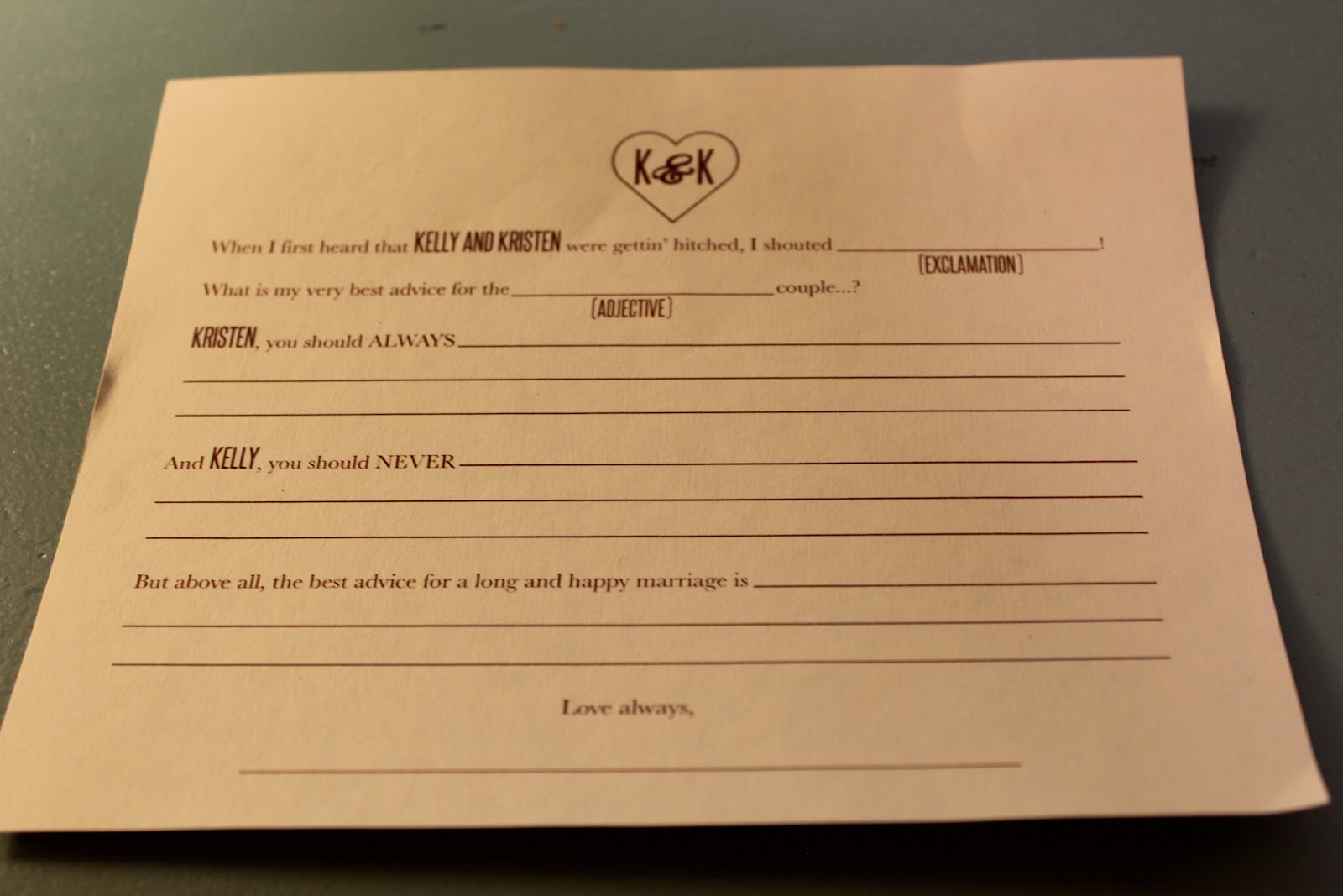
a wedding lore fact sheet (behind program), a mad lib guest card, 
personalized cup sleeve for the cocoa bar downstairs, and the birdseed favors.
 These matched the invites she designed.  I'll show you a pic of one of those in another post.


Mad Lib, tweaked from HERE.


Wedding lore we gathered and edited from different online sources. Maddie added the graphics.


Close up of the program, (using inspiration from THIS), so's you can read it :)


Next up, our wee Bridal Herald carrying the burlap sign I made for her:


Here's a picture of her outfit.
(pic by gramma of the groom)

She wore a handmade chocolate brown tutu with a neutral cardigan that I embellished with a similar brooch of handmade flowers like the bride's waistband.
She was bookin' down that aisle!


Here's how I made the Bridal Herald sign:
I got some thin foamboard, painted then hot glued some dowels to the back, used some spray adhesive to adhere the burlap, and pulled threads for the fringe.  Then I tied bits of ribbon, torn muslin strips (used on the corners of the ivory burlap pennant banners as well), and lace hem tape to embellish the top.
Lastly, I traced chipboard letters onto cereal boxes, painted them with acrylic craft paint, then hot glued them onto the burlap.


My daughter-in-law and bridesmaid made this super cute banner out of fabric 
we bleached, tea-dyed, then stencilled:


Then there was the banner I made for outside, using the dark brown burlap and using the same technique I used for the bridal herald signage...tracing, painting and hotgluing the letters on:
(I showed you this pic before, but it's the only shot I have with the banner in the background)
Says "Kelly and Kristen"


And the photo booth!  What fun was had at the photo booth!
Painted a formica desk top with chalkboard paint, then wrote on it with chalkboard marker.


All the costumes and props we had available.


And here's me! 
Showing off the fabric flower corsage I made with a brooch containing Kristen's baby pic. 
 I made a similar one for the groom's mama with Kelly's baby pic.


We made all the bridesmaids/bride herald bouquets and hair pieces, men's bouts and ladies corsages, and Kristen's birdcage veil/fascinator and waistband by hand.  
The only live flowers we used were bunches of baby's breath circling the cakes, for the bride's bouquet/tossing bouquet, and the grooms bout. 

(I LOVE this picture my brother caught as Kristen and Hubs made their way down the aisle)

We also put some on the burlap and pinecone chair sashes lining the aisle.


Because I ordered so darn much (who knew 10 bunches would fill a palace???)
I filled two big brown-painted terra cotta pots with the remaining ginormous tufts of baby's breath on either side of the entrance to the aisle.


And hey, guess what I was doing minutes before the ceremony began?


Wielding the trusty hot glue gun, fixing the pin on the back of  Kelly's flower.
Eegads, it never ends....

Lastly, a pic from Kelly's aunt taken of the couple's first dance, so you can see a bit what the whole room looked like.  The hanging centerpiece was lighted organza with swathes of burlap underneath.


I was pretty stoked with how everything looked, and am kicking myself for not taking more pictures....
Again, if you want to see the REAL DEAL,visit our photographer's page:
They captured the mood of the celebration perfectly, 
as well as lots of the stuff I showed you above 'in action'.

If you made it to the end of this tome, kuddos to you!
I'll be back with a few more wedding shots in the next day or so (can't help myself), 
then it's on to other stuff.
For Reals.

Linked to the parties listed in my sidebar.
Edited to add:  linked to Donna's Party Ideas Sat. Nite Special

LinkWithin

Related Posts with Thumbnails